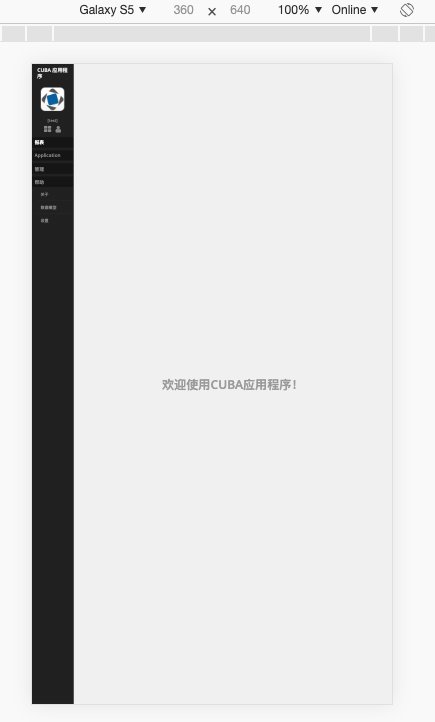
Hi team,
I’m trying with new responsive side menu window. But when i use Chrome to inspect the page with phone size, it doesn’t collapse, just become narrow:
Hi team,
I’m trying with new responsive side menu window. But when i use Chrome to inspect the page with phone size, it doesn’t collapse, just become narrow:
Hi,
It does not use mobile view because you did not switch cuba.web.useDeviceWidthForViewport application property to true. See also Appendix B: Application Properties - CUBA Platform. Developer’s Manual
Hi Yuriy,
Glad to see you’re still helping!
Forgot to mention, this should be documented in the manual.
The team is always glad to see PRs and issues in the documentation repository: GitHub - cuba-platform/documentation: CUBA Platform Documentation