GanttChart: questions

I have few questions:

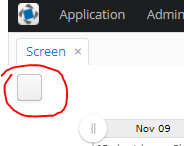
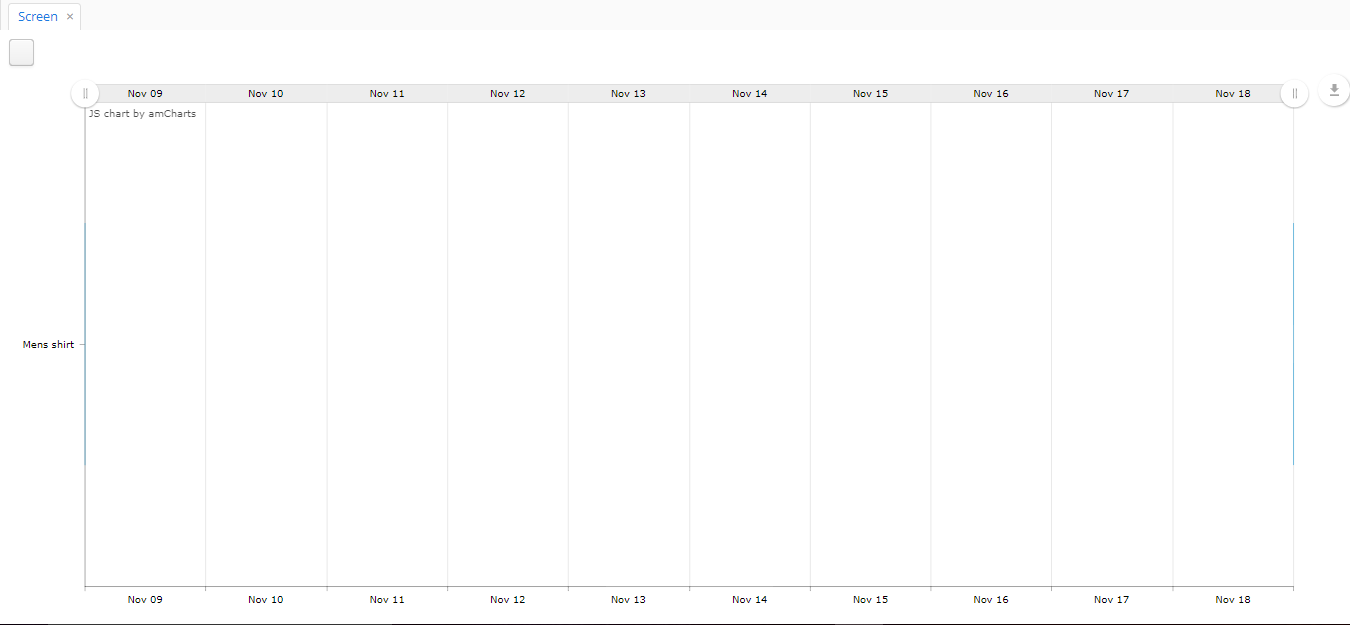
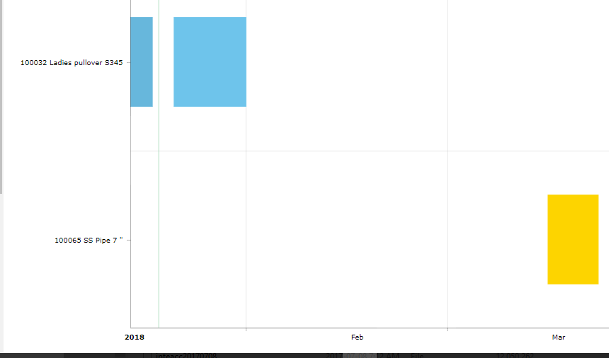
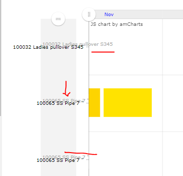
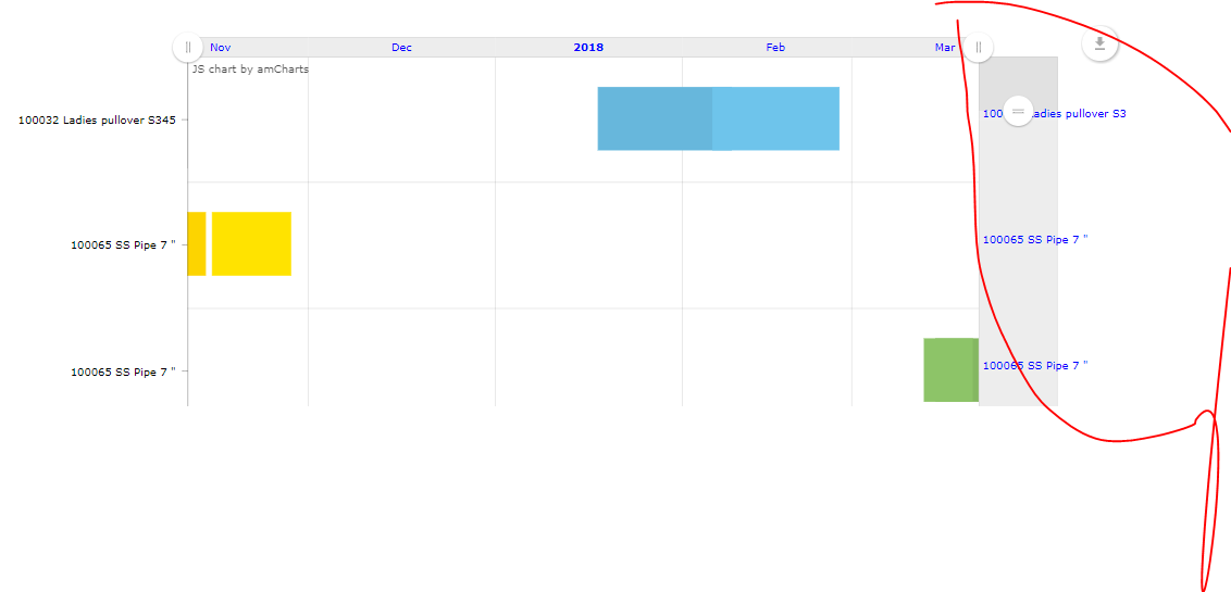
  1. I have a GanttChart where the bar not displayed properly (very tiny bars) and date starts:

Here is the display:
image

Here is the xml

      <layout>
    <chart:ganttChart id="ganttChart"
                      additionalSegmentFields="operation"
                      balloonDateFormat="JJ:NN"
                      brightnessStep="7"
                      categoryField="material"
                      columnWidth="0.5"
                      datasource="planOrdersDs"
                      endDateField="operPlanStartDate"
                      height="100%"
                      marginRight="70"
                      mouseWheelScrollEnabled="true"
                      period="DAYS"
                      rotate="true"
                      segmentsField="planOrderOperations"
                      startDate="2018-01-01"
                      startDateField="operPlanStartDate"
                      theme="LIGHT"
                      width="100%">
        <chart:graph balloonText="&lt;strong&gt;[[operation]]&lt;/strong&gt;: [[open]] [[value]]"
                     fillAlphas="1"/>
        <chart:valueAxis type="DATE"/>
        <chart:valueScrollbar autoGridCount="true"
                              color="BLACK"/>
        <chart:chartCursor cursorAlpha="0"
                           cursorColor="#55bb76"
                           fullWidth="true"
                           valueBalloonsEnabled="false"
                           valueLineAlpha="0.5"
                           valueLineBalloonEnabled="true"
                           valueLineEnabled="true"
                           valueZoomable="true"
                           zoomable="false"/>
        <chart:export/>
    </chart:ganttChart>
</layout>
  1. If I change the period from DAYS to WEEKS or MONTHS, nothing changed. How can I display Gantt Chart in Week or Month period buckets?

  2. I want to display specific horizon say, 36 periods (weeks).

Thanks for your help.

Hi,

Could you please send us a small demo project with your data model (sample data will be appreciated) and GanttChart configuration?

Regards,
Gleb

Hi Gleb
I have prepared a small app to replicate it as attached. After running the app you can generate the records by clicking the following button once:

image

You will see this Gantt, exactly similar to what you shared earlier from my main app.
image

Thank you in advance for Letting me know how can I resolve my questions 1, 2 & 3.test-gantt.zip (96.9 KB)

Hi,

  1. The startDateField and endDateField attributes refer to the same Entity field so they have the same value, i.e. a segment has no duration. That why segments are displayed as a tiny bar. So, you can either provide the endDate field or the duration field.
    Take a loot at these samples: Gantt with duration and Gantt with dates

  2. The period attribute has no effect if the startDateField and endDateField are used, i.e. a segment duration is calculated as difference between start and end dates.

  3. The GanntChart adapts to your data, so if you will provide data for 36 weeks, you will see 36 weeks.

Regards,
Gleb

Thank you Gleb.

  1. Thanks, that was my mistake.
  2. Understood the role of period attribute as explained. However, what I am looking for is, I want to display the Gantt with different options of bucket i.e. DAYS, WEEKS, MONTHS. How can we achieve that? And I want to change it programatically.
  3. Yes, clear about the data but when I have a long horizon, the bars are squeezed and doesn’t look nice (as below). Then when I use the scroll bar, days become months leaving a big gap in display. Thus reduces readability. How can we put some days/weeks in between? Can we also show grid lines?
    image
  1. You can inject the chart and change the period programmatically. But, as I said before, this property does not have any effect on date fields. If you will use startField,endField and/or duration which are numbers, not dates, you will need to convert values manually. I mean that changing “period” will not convert values to another resolution, only value.

  2. You can add scrolling to a chart, for instance:

    <chart:valueScrollbar autoGridCount=“true”/>

Regards,
Gleb

Thank you @gorelov
Another question, How can I get the vertical scrollbar?

Take a look at chartScrollbar. You can find an example here.

Hi @gorelov
Thank you. When I used this xml code, i see the label a shed
<chart:chartScrollbar autoGridCount=“true”
backgroundAlpha=“0”
color="#AAAAAA"
graph=“g1”
graphFillAlpha=“0”
graphLineAlpha=“0.5”
offset=“30”
oppositeAxis=“false”
scrollbarHeight=“80”
selectedBackgroundAlpha=“0.1”
selectedBackgroundColor="#888888"
selectedGraphFillAlpha=“0”
selectedGraphLineAlpha=“1”/>
image

and when I only keep this code,
<chart:chartScrollbar autoGridCount=“true”
scrollbarHeight=“80”
color=“BLUE”
/>
the scroll bar moves to the right and duplicating the labels.
image

How can i remove the labels when it is at the right side. And when It is at the left side, how can we remove the shed of label texts?

Remove the autoGridCount attribute to get rid of labels. Add oppositeAxis="false" to move scrollBar to the left.